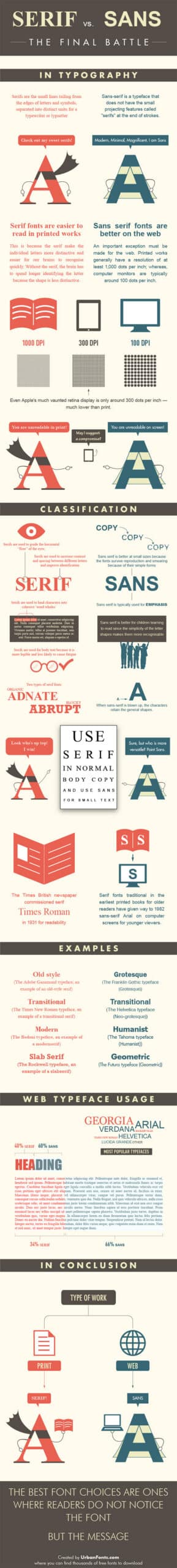
Readability: Serif vs. Sans Serif
One of our favorite blogs, Brandflakes for Breakfast, posted a really cool graphic from UrbanFonts.com that explains the difference between Serif and Sans Serif fonts, and when you should use them. As marketers, it’s important to understand which fonts should be used for web and which should be used for print for optimal user readability. As the graphic explains, "the best font choices are ones where readers do not notice the font but the message." Take a look.