
Psychology Behind Brand Logo Colors
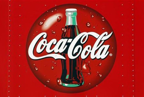
Ever wonder why logos are a certain color? Think it’s just a coincidence or the designer’s preference? According to this article, it might not be. There is a certain psychology behind color choices and how colors make consumers feel about a brand or product. According to Design Beep, the color green is associated with growth and vitality, which would make it the perfect color for a company (we’re looking at you Starbucks) that is very eco-friendly. Red evokes passion and excitement, and if you’ve seen some of Coca Cola’s ads in the last how ever many years, it’s pretty undeniable that this is the brand image they are portraying. Blue is interesting. Not only is it serene and calming, it also promotes productivity and engagement, which is why it makes sense for Facebook and many other social media brands to use it. Yellow is a bit more straightforward, as it evokes happiness and playfulness, which is exactly how McDonald’s wants you to feel when you eat their food. Finally, purple is often associated with royalty, sophistication and class. And for Cadbury chocolates, this is how they’d like their brand image to seem to consumers. Think about the colors of your favorite brands’ logos and ask yourself if the color lines up with the brand’s intended message. (Via)