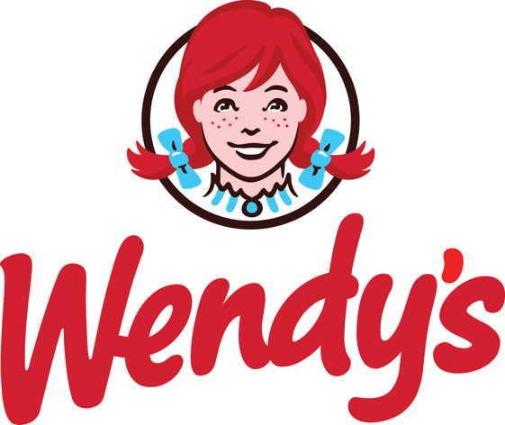
As part of a complete overhaul, burger chain and our client, Wendy’s, is getting a logo makeover for the first time since 1983 in an effort to re-brand itself as a high-end fast food restaurant. The new logo no longer has a yellow background but instead has a clean, white background with a casual red font. The little girl with red pigtails we’re used to seeing looks more "grown up" as well. Overall, though, it still captures the same wholesome image that founder, Dave Thomas, dreamed of when he opened the first location in Dublin, Ohio. The company tested several logo designs in the past few months and were pleased with consumer response. Interestingly, it’s only the 5th logo change since the company’s inception in 1969. By 2015, Wendy’s plans to have half its 1,425 company-owned locations renovated with the new logo and branding as well as a modernization of the outdated restaurants themselves, including even employee uniforms. What do you think of the new look?